Color and Architecture: How Colors Shape Buildings and Transform Spaces

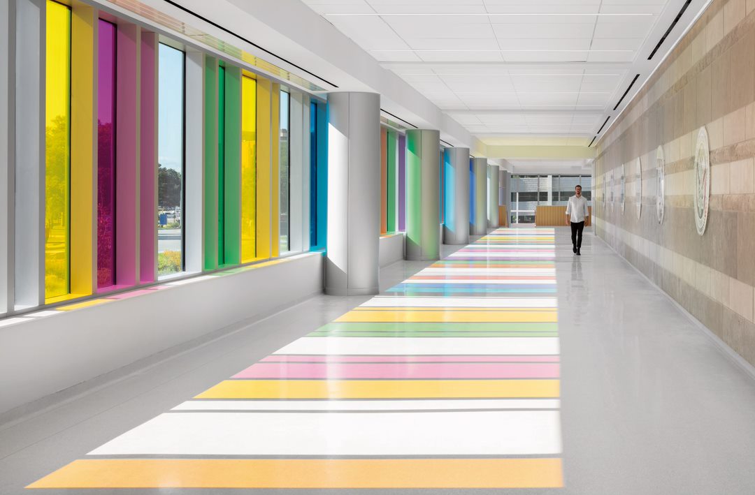
VA Ambulatory Care Center opens in Omaha (AJ Brown Photography/ ©LEO A DALY)
Color plays a major role in our everyday lives, especially when it comes to architecture. When you walk into a room, or stand in front of a building, the colors you see can completely change how you feel. Let’s explore how color impacts architecture and why it’s so important in making spaces that are not only functional, but also beautiful.
Color in the History of Architecture
Many people might think of ancient Roman buildings as plain and gray, but recent discoveries have revealed that these structures were actually full of bright colors and detailed decorations. The Greeks, who influenced the Romans, also used vibrant colors in their architecture. This new understanding changes how we see these ancient buildings and shows that color has always been key to shaping spaces.
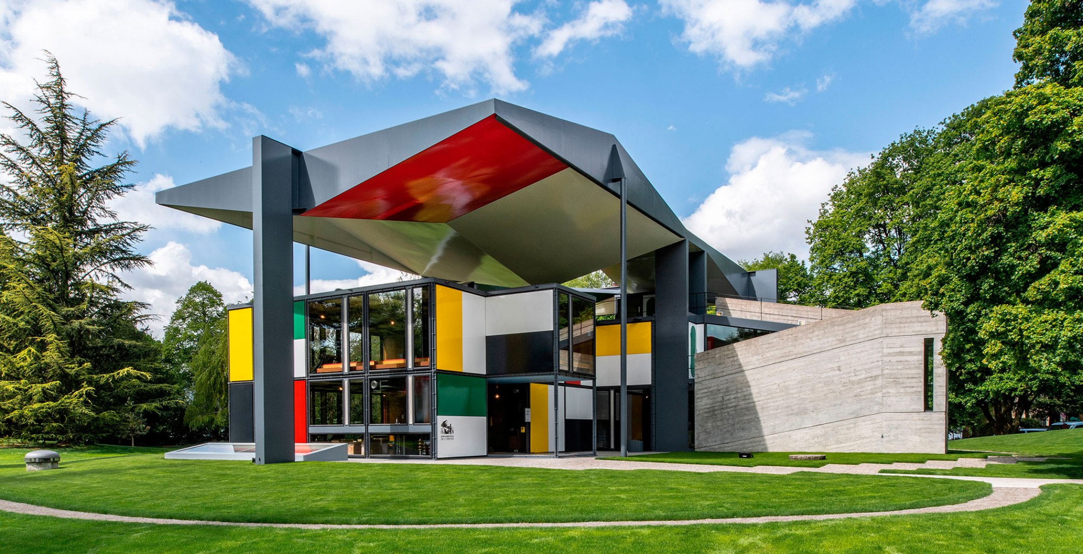
Fast forward to more recent times, and you find architects like Le Corbusier and Luis Barragán, who are known for their bold use of color. These architects understood that color can change how we experience a building. It can make a space feel lively, calm, warm, or cool. Other architects, like Michael Wilford and James Stirling, became famous for their creative use of color in public buildings, art centers, and museums.

Zurich pavilion Le Corbusier, 1998
Why Color Matters in Architecture
When architects design a building, they don’t just think about the shape and structure—they also think about color. Choosing the right colors can make a building stand out or blend in with its surroundings. It can also guide people, like using a bright red door to show where the entrance is. Color can make a space feel welcoming or intimidating, cheerful or somber. It can also help organize a space. For example, in an office building, using different colors can help you understand where the meeting rooms are or where the cafeteria is. This makes color a powerful communication tool.
The Challenge of Working with Color
Choosing the right colors isn’t as easy as it might seem. Architects have to think about a lot of things, like how the colors will look in different lighting, whether they’ll fade over time, and how they fit with other buildings nearby. Some colors can make a space feel bigger, while others can make it feel smaller.
Michael Wilford, a renowned architect, once said, “The reason for introducing color is to bring joy, delight, pleasure.” He believed that color adds something special to a building and makes it more enjoyable to be in. This is why architects spend a lot of time choosing just the right shades and tones.
Color in Exterior Architecture
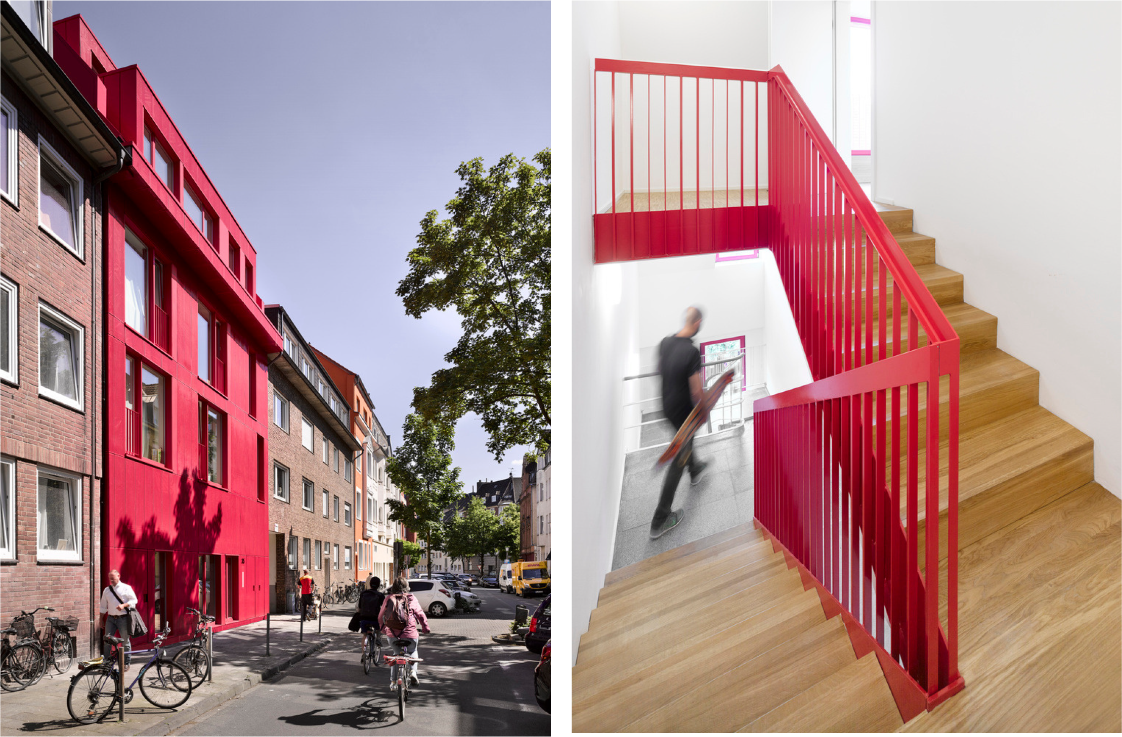
While we often think of colors for indoor spaces, they are just as important on the outside of buildings. Colors on the exterior can make a building stand out in a crowd or blend into the background. They can also give clues about what the building is for or who owns it. A bright yellow building might be easy to spot, while a sleek gray one might suggest a more serious tone.

Raspberry House | Kresings Architektur | Arch Daily
Colors can also create visual focal points that attract attention. For example, a building with a bright blue accent on the roof or a striking red stripe on the side will draw the eye. This use of color can help a building become iconic and memorable, making it easy for people to find and remember.
Color Makes Architecture Come Alive
Color has a unique way of bringing architecture to life, transforming spaces and influencing how we experience them. It can evoke emotions, direct our attention, and make buildings more memorable. When architects use color thoughtfully, they can create environments that not only serve their intended function but also evoke a sense of joy and wonder.
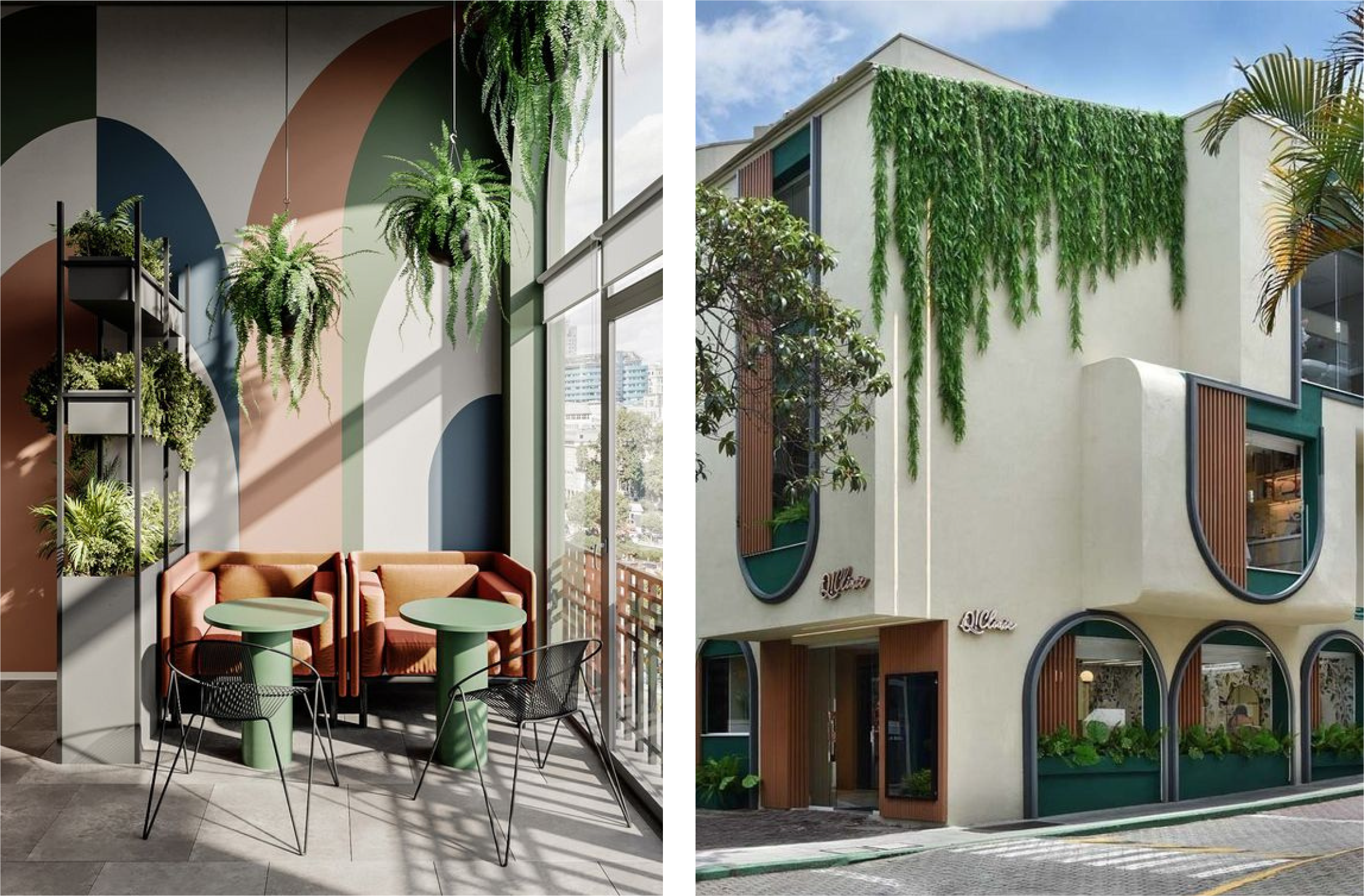
Consider the impact color has on our daily experiences. In a bustling coffee shop, warm tones like deep browns, rich reds, and muted oranges create a cozy and inviting atmosphere, encouraging people to sit and relax. Meanwhile, in a serene spa, cool blues and soft greens promote tranquility, helping visitors unwind and de-stress. In a playground, vibrant colors like bold reds.

Source Pinterest
The power of color in architecture lies in its ability to shape our perceptions and subtly influence our moods. It can make a space feel larger or more intimate, energizing or calming. Architects can use color to create visual harmony or to provide a striking contrast. For example, the use of bold, contrasting colors in public spaces can help guide visitors through complex layouts, while a monochromatic palette can create a sense of unity and continuity.
Next time you walk through your neighborhood or visit a new place, take a moment to notice the colors around you. Whether it’s the soothing pastels in a healthcare facility or the bold, energetic hues in an art gallery, each color choice is deliberate, designed to evoke a specific response. This is the beauty of color in architecture—it shapes our environment and enhances our experiences in ways that might often go unnoticed, yet have a profound impact on how we connect with the spaces around us.
Written by
Tina Elham Karimian
May 2024
